Brutalist Editorial
News & reading app designHard borders, serif headlines and a lime highlight
Latest
Story
Saved
Topics
Profile
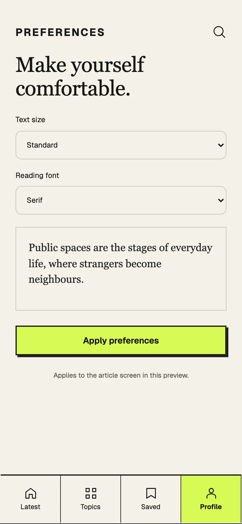
Preferences
About this style
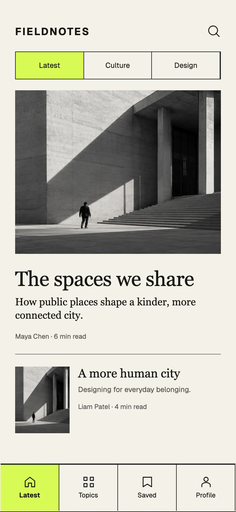
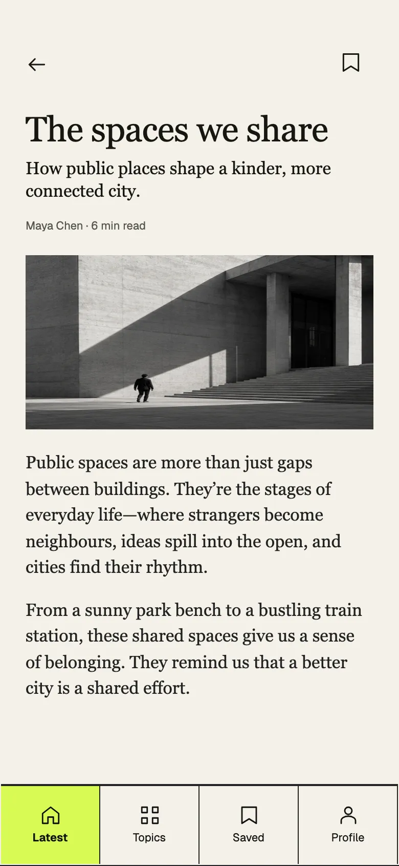
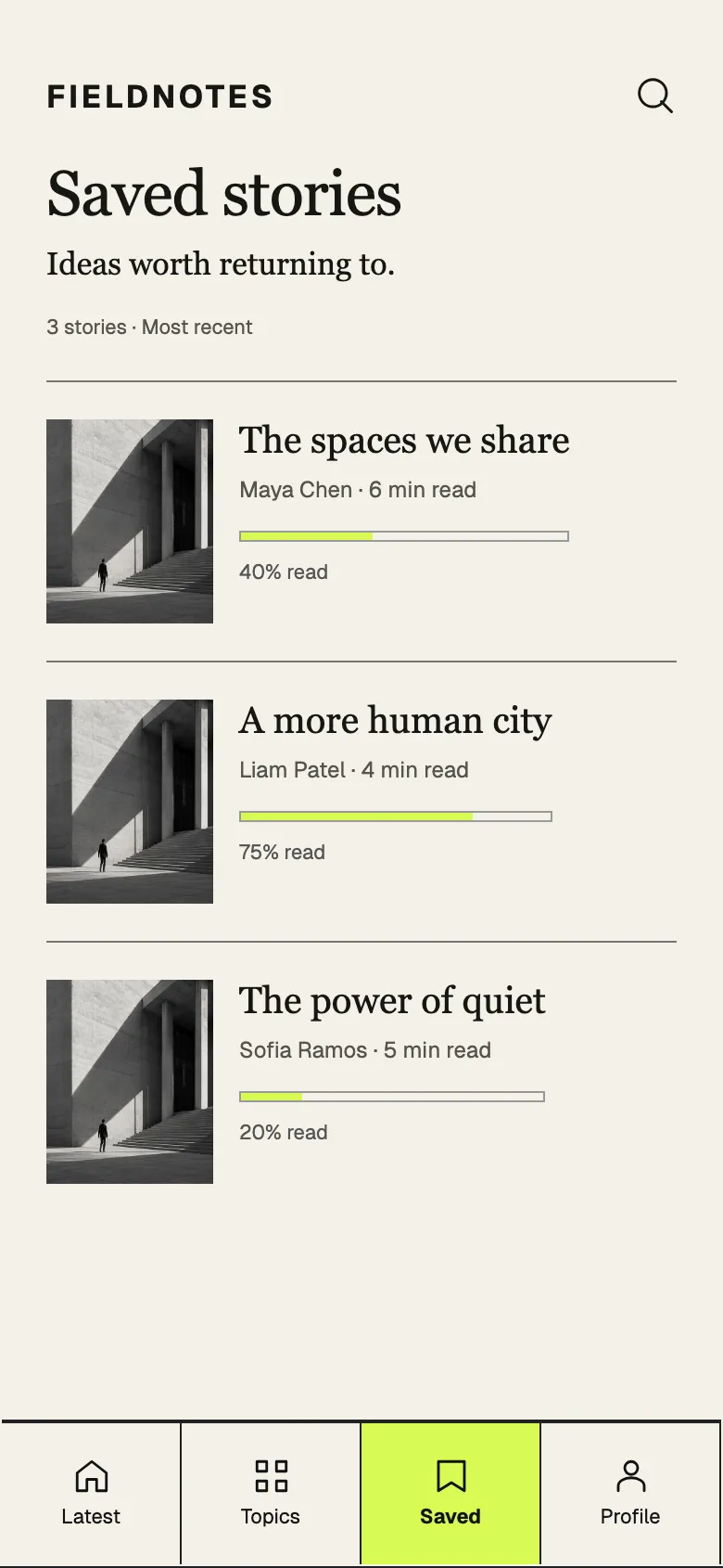
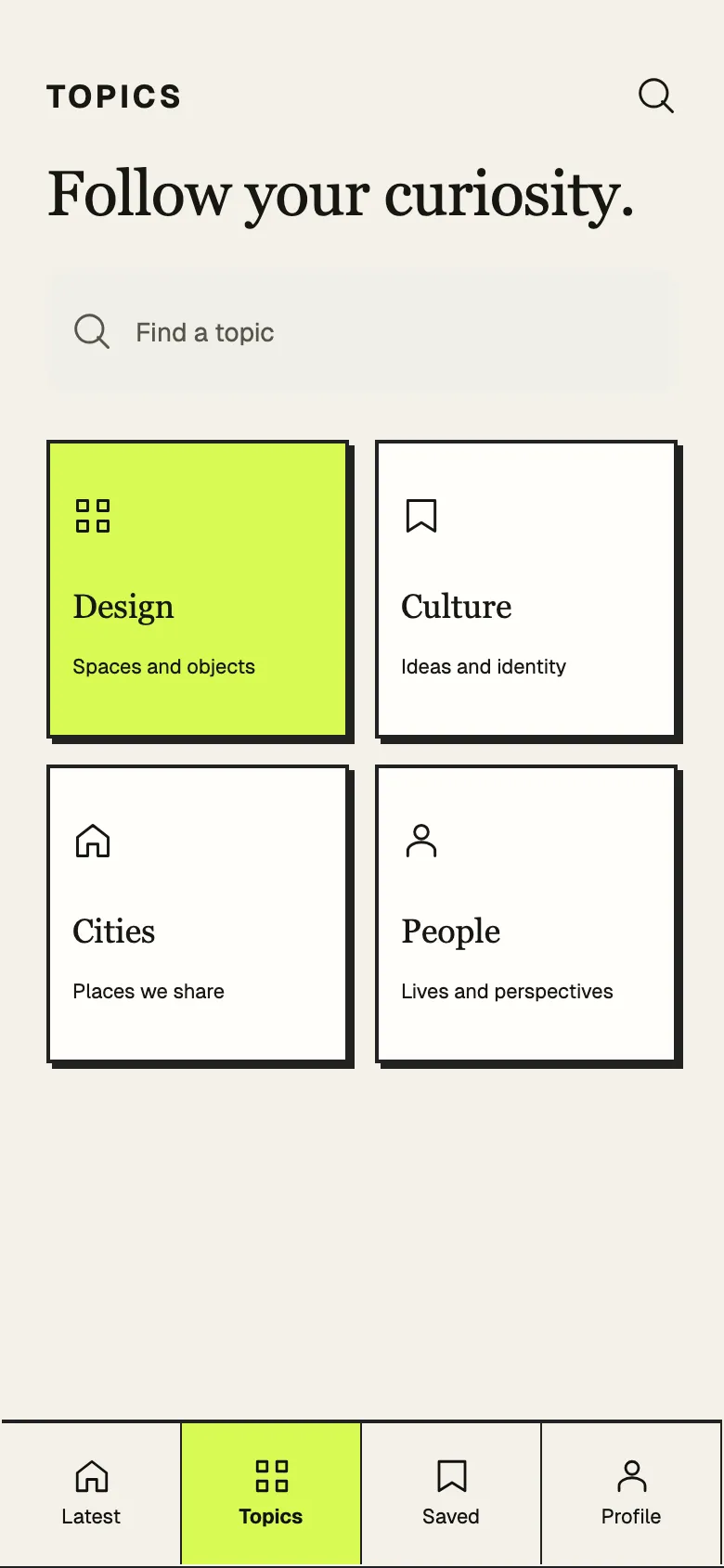
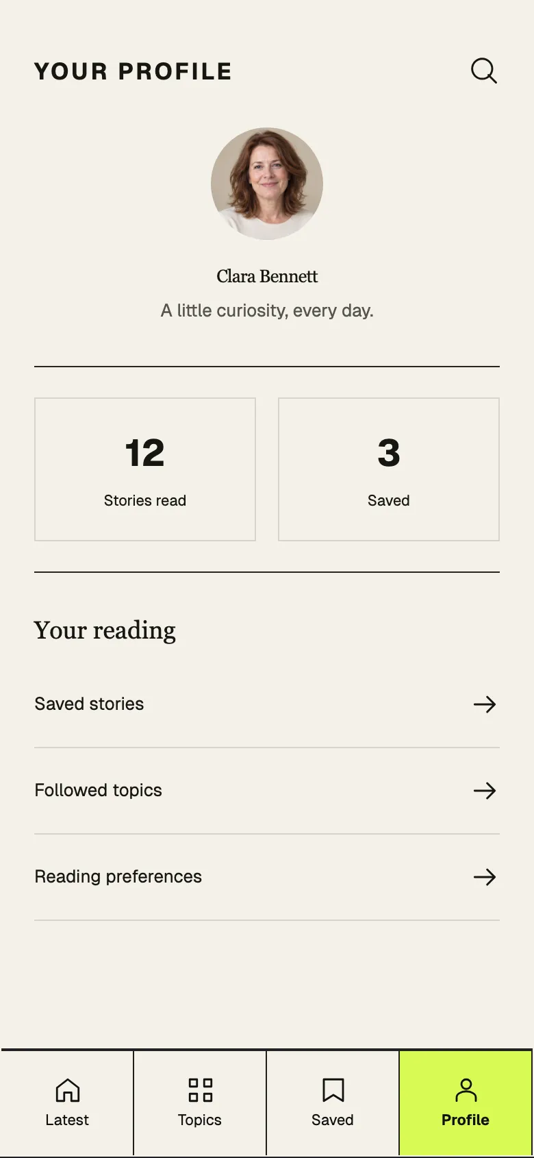
A reading app with a tracked wordmark, serif headlines, black-and-white photography and boxed, sharp-cornered controls with hard offset shadows. Lime marks selection.
Reading deserves structure; strong borders and a serif voice frame each story like print, with one lime highlight for where you are.
What makes it recognisable
- Tracked uppercase wordmark over serif headlines
- Sharp boxes with hard black offset shadows
- Boxed bottom tabs with a lime active cell
How ShipNative uses it
Pick Brutalist Editorial when you describe your app and ShipNative plans and draws every screen in this look: the same colours, type and layout rules applied to your features. The screens above are from Fieldnotes, a demo app designed in this style; your app gets its own screens.