Pace
Fitness app designNeon lime on graphite, built for mid-run glances
Home
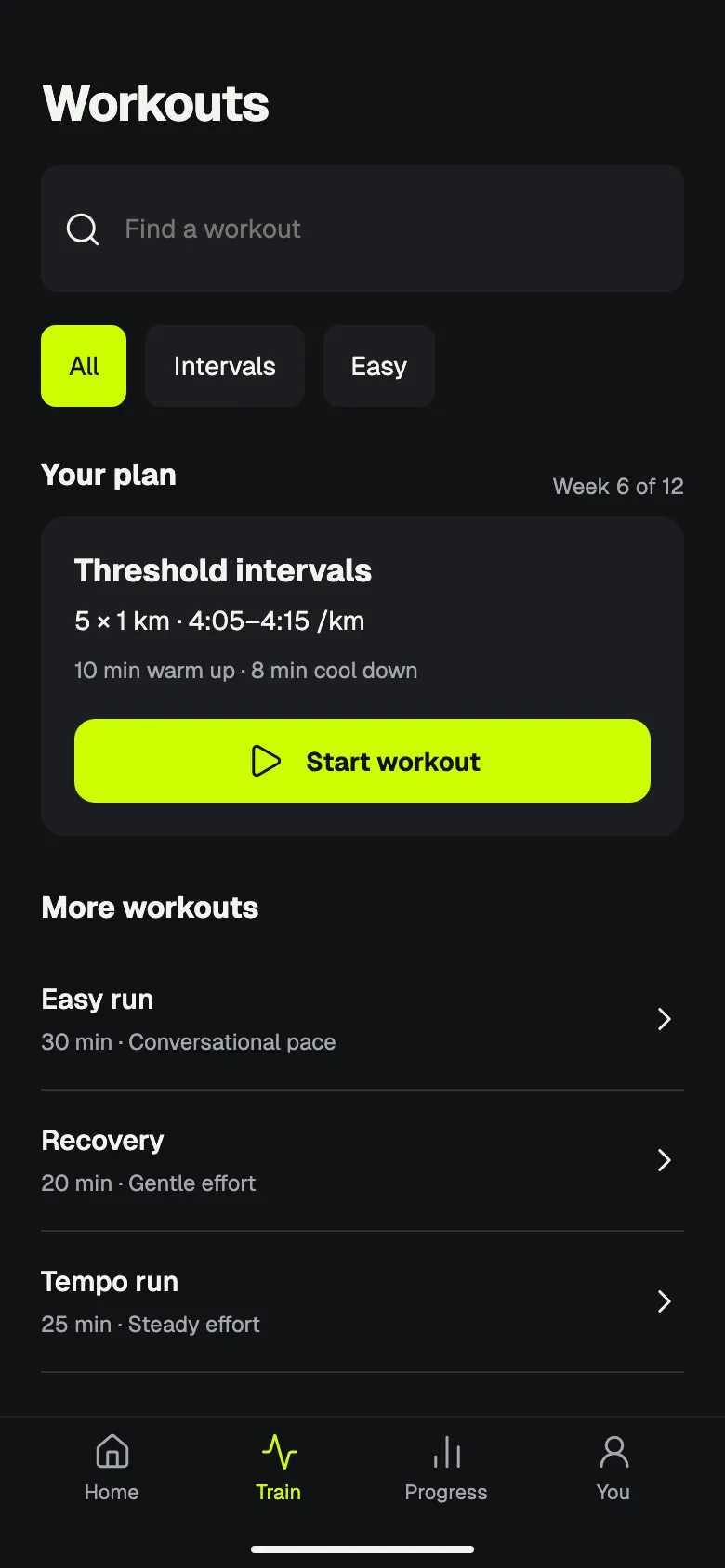
Workouts
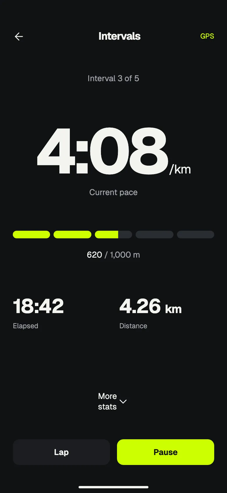
Active run
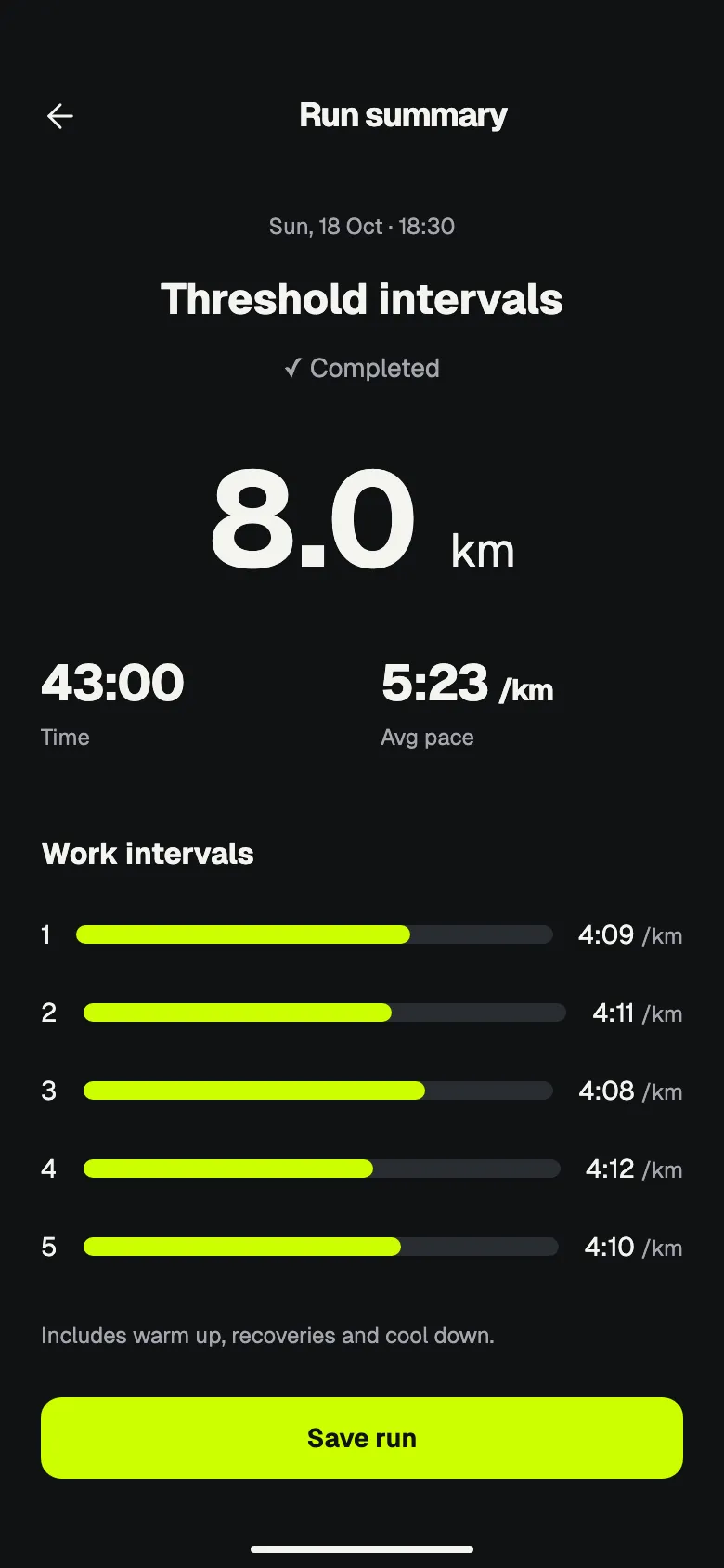
Run summary
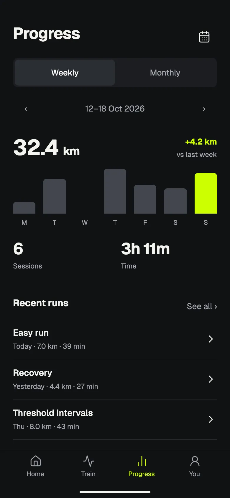
Progress
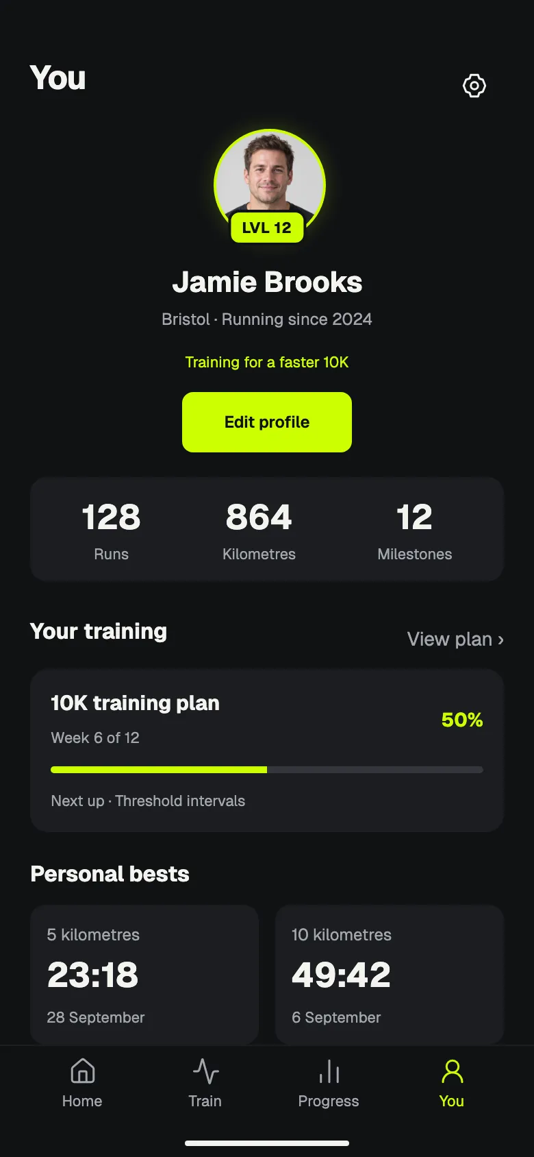
Profile
About this style
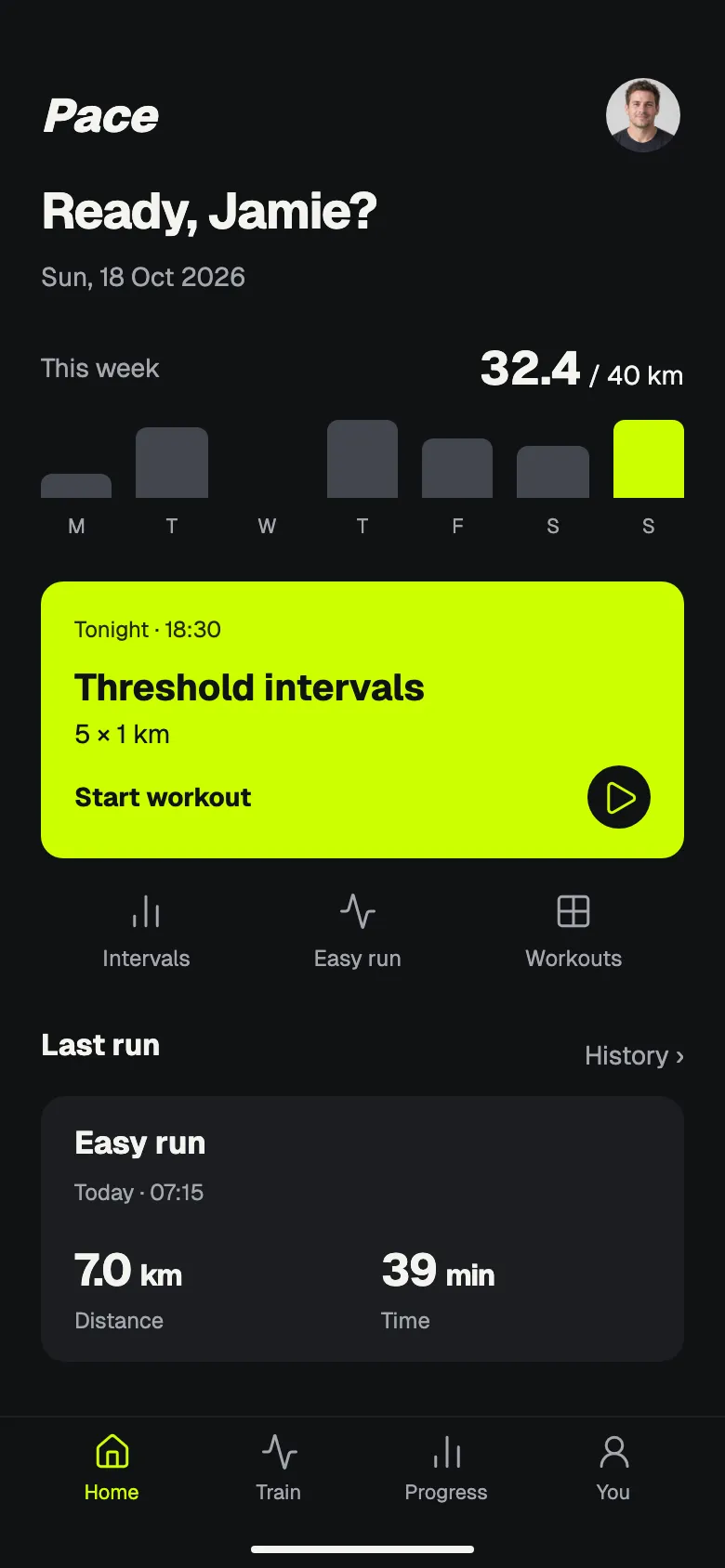
A running app on near-black with one neon lime signal colour. Big pace numerals, compact weekly bars and plain workout lists; the lime is kept for the plan card, progress and the main action.
Mid-effort, a runner reads one number; graphite keeps everything else quiet so the lime signal and the numerals carry the screen.
What makes it recognisable
- Lime plan card and primary buttons with black text
- Oversized pace and distance numerals
- Rounded weekly bars with the current day in lime
- Glowing lime portrait frame with a level badge on the profile
How ShipNative uses it
Pick Pace when you describe your app and ShipNative plans and draws every screen in this look: the same colours, type and layout rules applied to your features. The screens above are from a demo app designed in this style; your app gets its own screens.